The story of a small typographic mark is a story of scale. A once obscure character, lingering on a teletype keyboard, became the hinge between a person and a place. Half a century on, a single glyph has threaded identity through networks, devices, and daily speech.
From teletype to inbox
In 1971, a young engineer at BBN wired the first networked message across ARPANET, adapting a local mail tool to reach another host. The hardware was loud, the lines were slow, and the future was unwritten. Yet one decision—how to separate a person from a machine—would echo for decades.
The choice fell on a mark that felt available, neutral, and clear: the character read as “at,” bridging a user to a location. “Pick a key and make it mean something,” goes a common engineering instinct. In that moment, a punctuation orphan became a protocol.
Why that quiet character?
Before networks, the symbol lived mostly in accounting, meaning “at the rate of,” a tidy commercial shorthand. It appeared rarely in programming and so posed less risk of conflict. On the teletype, it was present, pronounceable, and blessed with a built‑in preposition: you at this host.
That fit matters more than it seems. A good delimiter is globally typeable, visually distinct, and semantically intuitive at a glance. “It just made sense,” many have noted—a minimal mark, maximal clarity.
Standardization made it stick
Once engineers wrote the behavior into early RFCs, software began to align around the same convention. The address format crossed from lab tools to university mailboxes, then from campuses to companies and home PCs. SMTP and the Domain Name System helped harden the pattern, and human memory did the rest.
Standards are social as much as technical. The more people typed the same little bridge, the more every keyboard needed to offer it, and the more designers ensured it was easy to find. Momentum turned into muscle memory.
A symbol that escaped its lane
When messaging leapt into public life, the glyph followed, hitching a ride on blogs, forums, and early IM. Then came social platforms that reframed it as a way to call someone by name in a sea of text—a mention, a ping, a soft summon. Overnight, it became the quickest path from “you” to here.
Developers found fresh jobs for it in code: decorators in Python, annotations in Java, and assorted framework conventions. Writers pressed it into witty titles and playful tags. Teachers used it to explain addresses—and, by extension, how the internet is stitched together.
Everywhere you look, it’s speaking
What began as a pragmatic separator now carries layers of meaning. It says “this is a person,” “this is a place,” and “this is a link between the two.” It announces direction—attention, context, relation—without a single extra word.
You can hear it across languages. In Italy it’s the “chiocciola,” a little snail. In Israel it’s “shtrudel,” a sweet swirl. In Germany, a “Klammeraffe,” the little monkey that seems to hang from the a. Cultures adopted the shape and gave it character.
The small lessons it keeps teaching
Tools last when they’re both easy and explanatory. The mark does not just divide; it describes. You at a domain: a sentence compressed into a single glyph. Good interface design favors such double‑duty signs—simple to type, simple to teach.
It also reminds us that ubiquity can be accidental. A quiet corner of ASCII became a daily habit, because one person needed a separator and chose the one that caused least trouble. “Innovation,” as the saying goes, “often walks in through the side door.”
What the key does for us today
- Anchors identity in email, the world’s most durable digital passport
- Triggers mentions that route attention in public conversations
- Signals machine‑readable structure in forms, filters, and parsers
- Serves as cultural shorthand for online life, from signage to stickers
Each role reinforces the others. A symbol that moves messages also moves meaning, and the cycle turns the familiar into the foundational.
The endurance of a good choice
Many marks have tried to be the face of the internet—slashed protocols, hashtags, shiny new emojis. Few have achieved this blend of utility and warmth: a tiny preposition you can actually say, a shape that feels both old and alive.
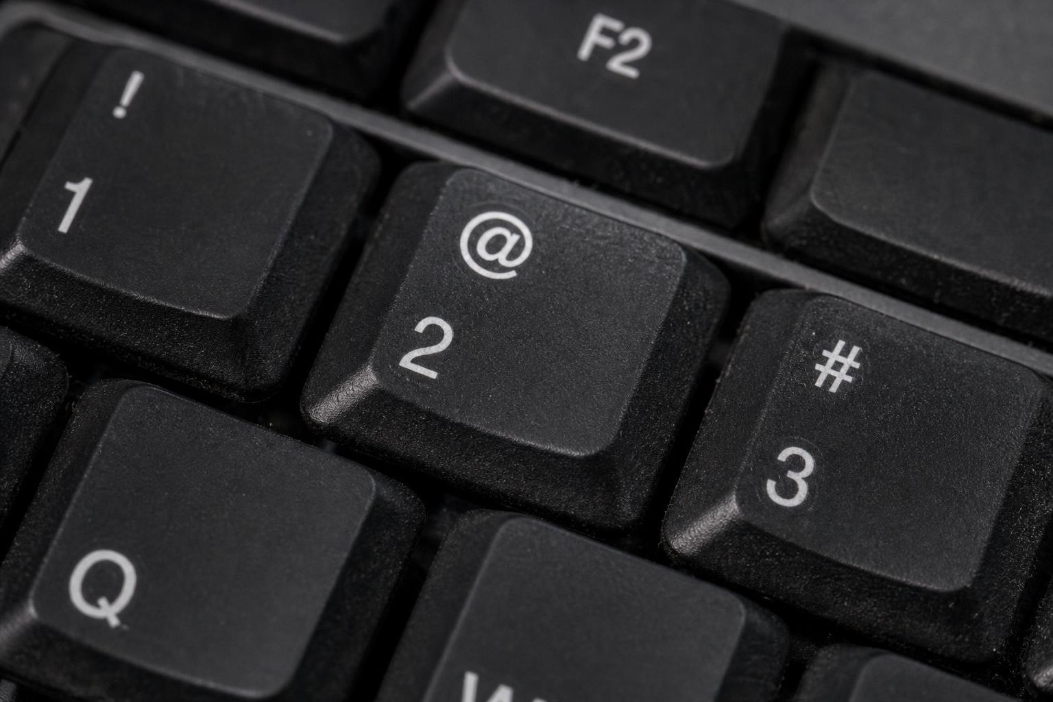
Press the key and you perform a small ritual that began with clattering teletypes and improvised code. You bind a human name to a place, and you ask a network to carry that bond to its destination. “From the right symbol, a whole practice can grow,” says the quiet voice of design history.
We keep it on every keyboard not out of nostalgia, but because it still makes sense. The mark is compact, human, and stubbornly helpful—a reminder that sometimes the best invention is the one that feels like it was there all along.