We wanted a folding iPhone to enjoy a large screen without giving up our Apple habits. Since its release on October 23, the Duo has taken the place of our Pro Max, and honestly, we don’t want to hand it back. That said, at €2,339, Touch ID, photography, and a good chunk of our apps have given us a handful of reasons to gripe.
To be honest, while we had hoped for a folding iPhone for years, it was more out of desire than necessity. After fifteen years in tech, you start wishing for something beyond merely rearranging camera lenses or picking between this year’s color options. You want a little excitement when you unbox a phone, to feel compelled to explore its capabilities. So, when Apple promises a large screen that folds into your pocket without abandoning your apps or your routine, naturally we’re eager to get our hands on it.
8 / 10
Best prices
amazon.fr
E.Leclerc
Carrefour
SFR
The Pros
- Solid construction and hinge
- Passport-like form factor that’s a pleasure to hold
- Discrete crease when folded
- Excellent speakers
- Power on par with the iPhone 18 Pro
- Comfortable autonomy
- IP68 rating
- Apps and games still rarely optimized
- Left-handers have no dedicated space
- Less reliable Touch ID than Face ID
- No telephoto lens, photos less consistent in low light
Test conducted on a smartphone loaned by the manufacturer.
Foldable smartphones, we’ve tried them since the very first Galaxy Fold. Yet the exterior screens felt too narrow for our liking, and the idea of leaving the Apple ecosystem behind always seemed to win out, with the SIM card eventually returning to an iPhone. After years using an Apple Watch, a MacBook, a Mac mini, and the same apps daily, switching phones becomes a little moving operation we don’t always want to perform.
The Duo therefore arrived with an almost irresistible proposition: reclaim our iPhone, its backup and settings, then unfold it to watch YouTube on a much more comfortable screen. No need to imagine a new multi-window workflow to justify its value. A good video on the sofa, a movie on a train, or photos to show family members already did the job.
After three weeks, the pleasure remains, to the point that we don’t want to go back to our old iPhone. Yet in daily use, some Apple decisions and apps that aren’t well adapted can be annoying.
The Duo has replaced our iPhone for daily use, with two SIMs on personal and business lines. The test ran on iOS 27.2, and, fair warning: the situation is evolving quickly, as some apps have already improved with updates.
Design and grip: a small jewel, but it wears its weight
When you open the box, the impression is immediately striking. The phone unfolds to reveal a large display facing you, and our starry white model looks truly stylish with titanium edges and flawless finishes. It’s hard to recall a new iPhone this handsome since the iPhone X, which also signaled a shift in perception.
The hinge adds a lot to the experience. There’s a satisfying resistance when opening, which evolves as you move it, and magnets guide it shut with a gratifying snap that almost begs you to reopen it. There’s genuine care in how you handle the object, which is fitting given how much time you’ll spend manipulating it.
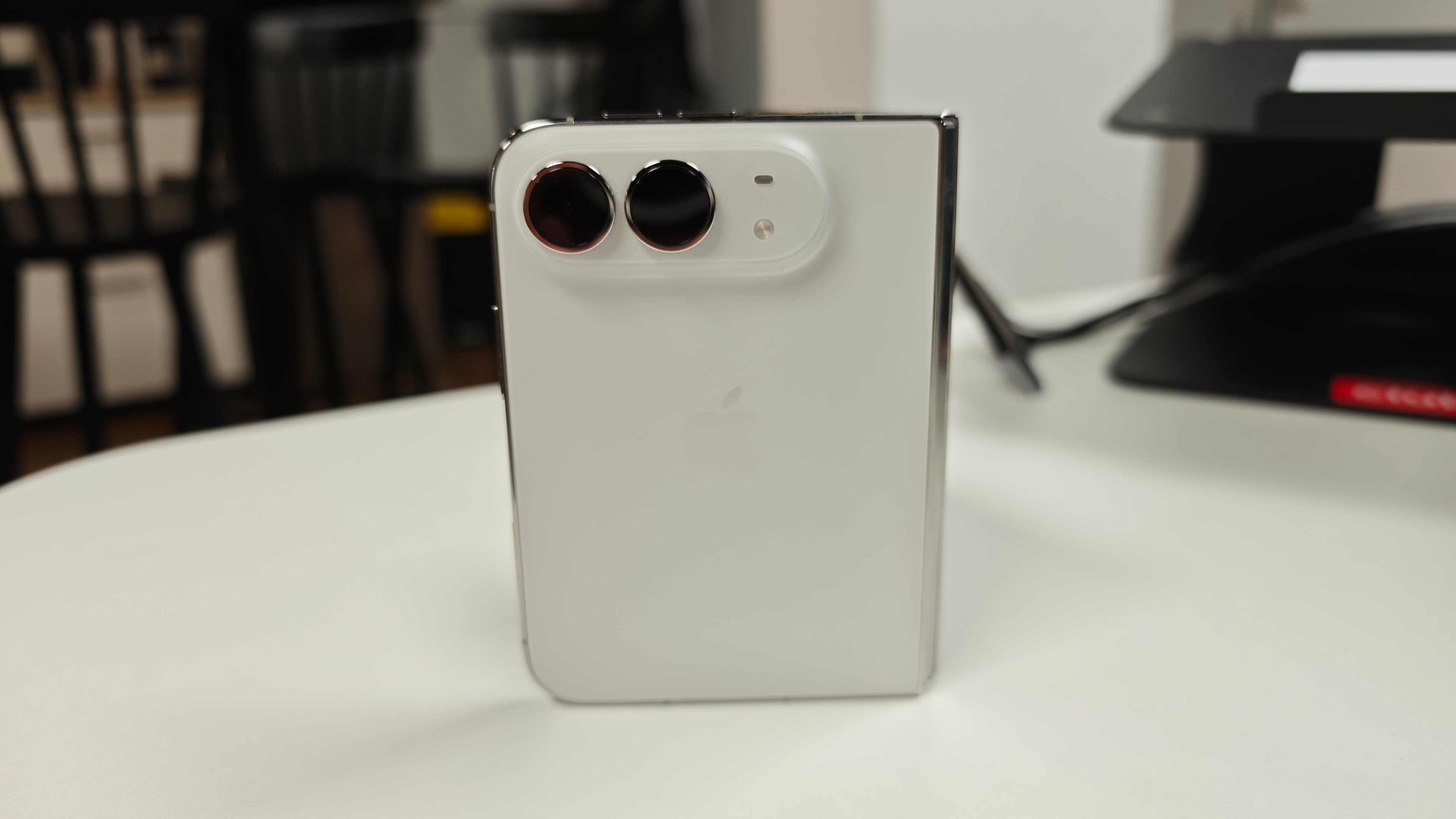
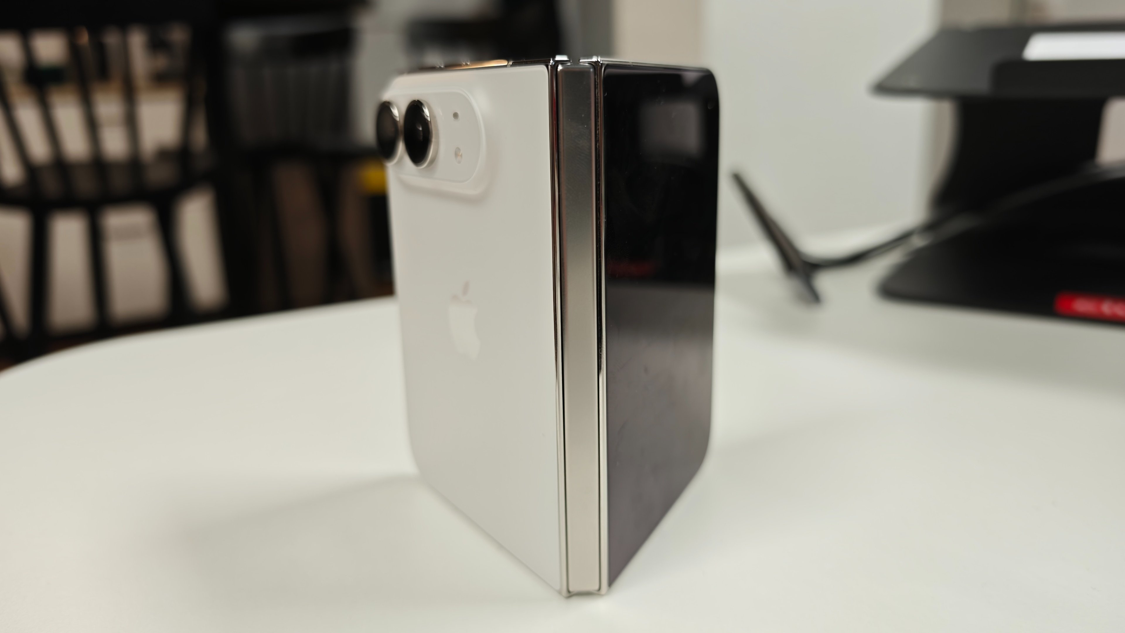
Frame and hinge cover in titanium: right from the opening, the Duo signals its premium ambitions. © Colin Golberg
We have a solid thing in hand, with no play and no immediate sense of fragility. And that’s not just a superficial impression: the Duo is IP68 certified, like any iPhone, whereas the Galaxy Z Fold 8 must settle for IP48. On a folding device, that’s no small thing.
Of course, we can’t talk about durability without mentioning the Crackgate episode. Just days after launch, photos circulated showing inner screens cracking along the hinge, on devices that hadn’t been dropped. Apple ultimately acknowledged this issue affecting “a small number” of units and invites affected customers to contact support for a replacement, without providing a cause or a figure. You don’t need AppleCare+ to get coverage for this defect. The most plausible theory at this stage is a faulty batch of hinge components from one supplier rather than a design flaw, but nothing confirmed. And since the Duo is already hard to find, obtaining a replacement can take some time.
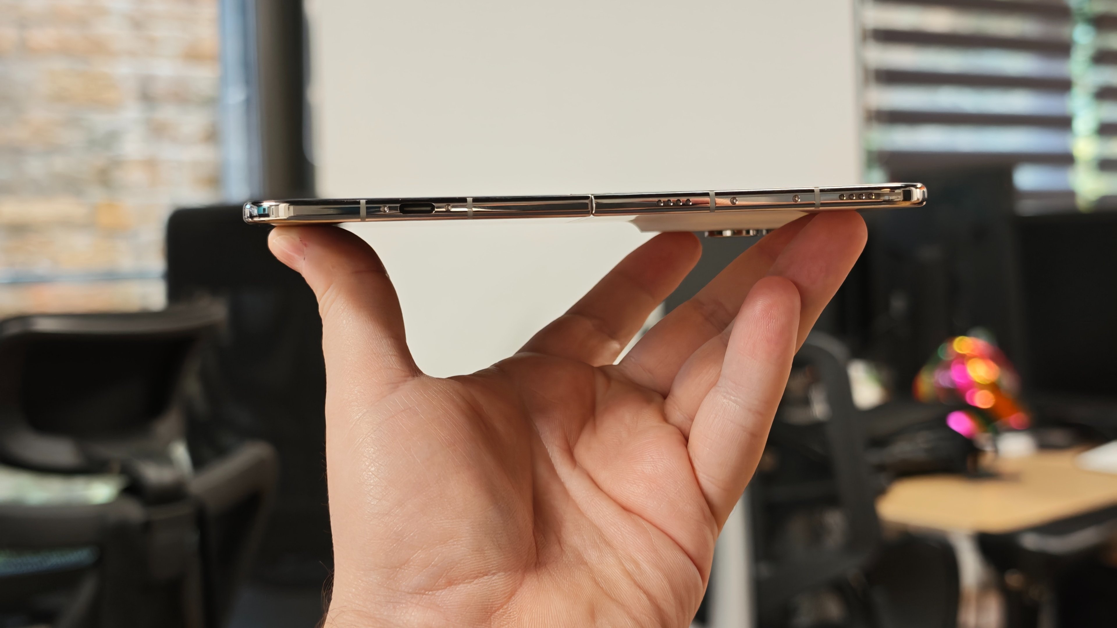
Our unit did not budge over three weeks of opening and closing. That should reassure, without drawing conclusions: if you decide to grab one, inspect the hinge area right out of the box.
Weight, however, makes itself felt quickly. The 254 grams, only a bit more than an iPhone 18 Pro Max, at first feels like you’re holding a premium object, dense and serious, before it becomes a bit less pleasant when trying to cradle it on your finger. In practice, it’s the width that poses the problem: with a form factor unfamiliar to the hands, you fumble, switch grips, and sometimes end up with a fatigue the 17 Pro Max avoided.
In the pocket, however, no particular issues. The Duo is thicker, certainly, but also notably shorter than our previous device—about five centimeters shorter—making it easy to carry without thinking about it. It’s really when you hold it for extended periods that its proportions demand effort.
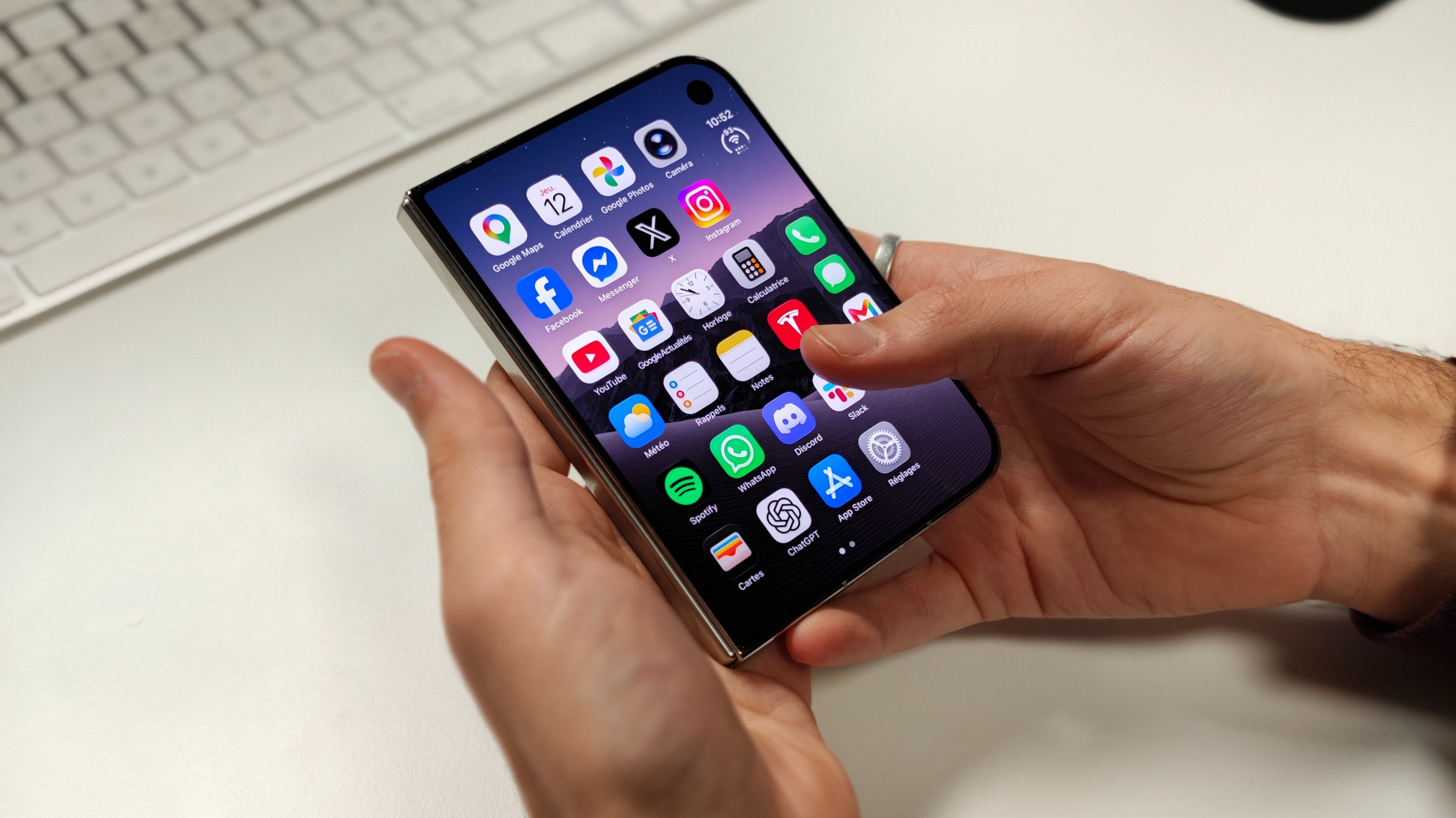
Closed, the Duo measures 117.8 × 84.1 × 11.3 mm. Compared to a Pro Max, it is 4.5 cm shorter in height, yet 6 mm wider and 2.5 mm thicker. © Colin Golberg
This passport-style format is, in fact, very appealing. Samsung’s earlier Fold models often left us wanting more: closed, they felt too narrow for comfortable typing; open, their shape didn’t always suit the content you’re viewing. Here, the keyboard is wide enough to chat on WhatsApp without needing to unfold the phone for every message.
Comparing to our 17 Pro Max, its screen is notably tall. Yet honesty requires admitting that the older device, with its narrower body, sits more easily in the hand and in more positions. You might prefer the Duo’s proportions and yet find the older iPhone easier to grab and hold for longer periods.
The volume buttons on the top add one more habit to pick up. Farewell to the Action button, though the Camera Shutter remains, and it sits perfectly beneath your finger when the phone is closed. Open, it becomes far less accessible, like all the other buttons. Not dramatic, but enough changes that you don’t instantly recall all reflexes, even after fifteen years of iPhone use.
Displays: the matte panel shines, and the crease fades away
At first light of the inner screen, we scan for the crease. From certain angles with light overhead, you can still spot it, and your finger can still feel it. But once you start using the phone, it largely disappears from view.
The nano-textured coating helps a lot. Reflections are greatly reduced, the crease area catches less light, and the texture feels almost paper-like—especially when you’re reading or flipping through photos for a while.
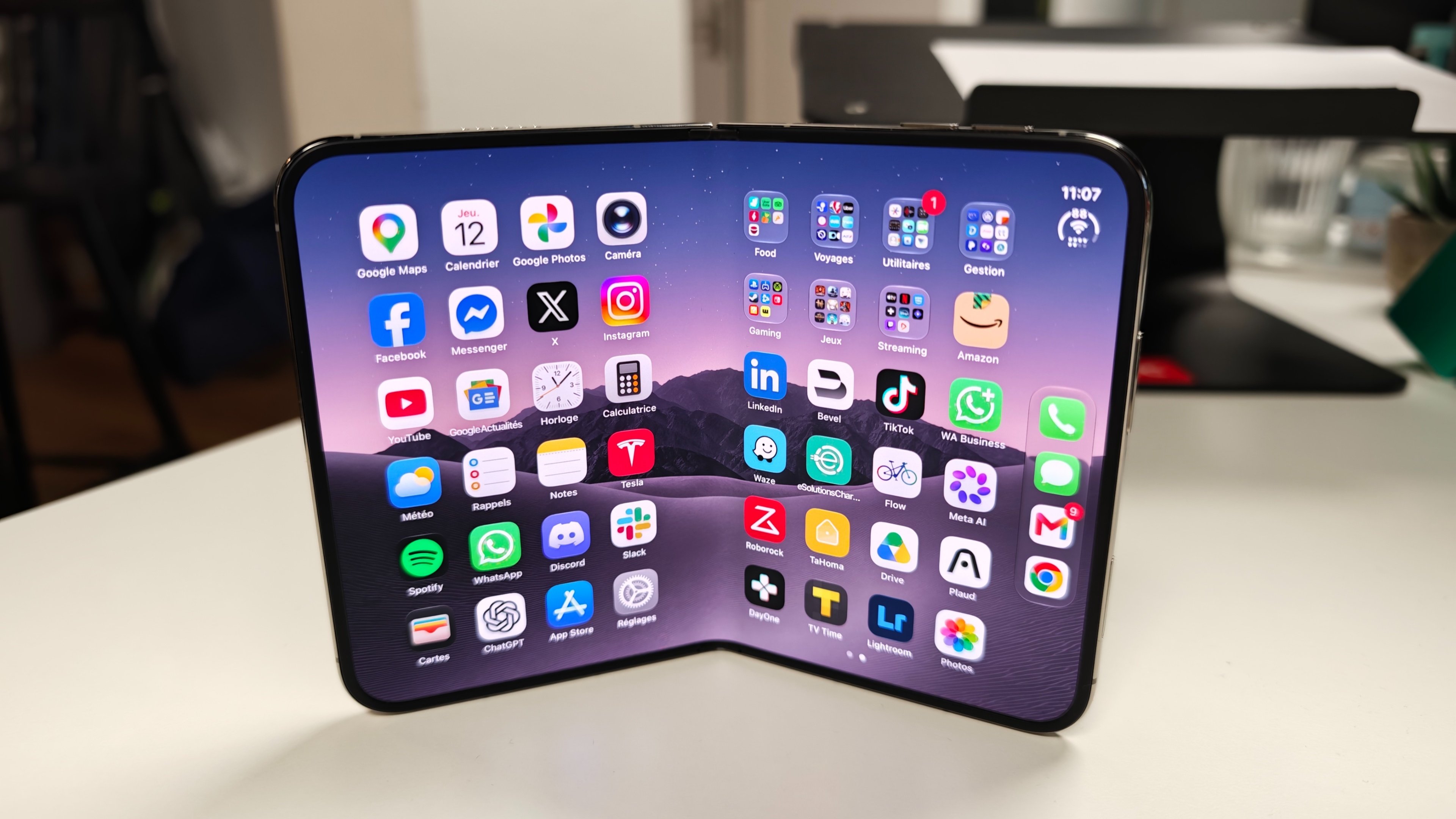
This finish is divisive, and we understand why. In a bright room, blacks feel less deep and colors aren’t as vivid as on a glossy OLED panel. But between this concession and the comfort of not having your surroundings reflected in the screen all the time, the choice was quickly made for us.
Good news: this protective layer can be replaced without changing the whole panel. And this isn’t a gimmick, since the crease tends to deepen with time. In France, the service costs 55 € excluding AppleCare+, or 19 € with this coverage. There’s no need to whip out a nail to test it—Apple handles it. On our unit, the crease didn’t budge an inch in three weeks.
Our unit, for its part, did not flinch over three weeks of open-close cycles. That’s reassuring, without leaping to conclusions: if you decide to buy, take the time to inspect the hinge at unpacking.
The weight, though, is quickly felt. The 254 grams—slightly more than an iPhone 18 Pro Max—initially convey a sense of owning a premium, dense, serious object, before becoming less pleasant when you try to cradle it on your finger. In practice, it’s mainly the width that proves awkward; with this form factor, hands aren’t used to it, so you fumble, shift support, and sometimes end up with fatigue that our 17 Pro Max didn’t cause.
In the pocket, however, there are no particular issues. The Duo is thicker, certainly, but also shorter than our previous phone—about five centimeters shorter—and it carries without requiring more thought. It’s really when you hold it for extended periods that its proportions require extra effort.
Cadre et étui-couverture en titane: dès l’ouverture, le Duo affiche de très haut de gamme. © Colin Golberg
On tient quelque chose de solide sans jeu ni impression de fragilité immédiate. Et ce n’est pas qu’un effet d’optique: le Duo est certifié IP68, comme n’importe quel iPhone, alors que le Galaxy Z Fold 8 se contente d’un IP48. Sur un pliant, ce n’est pas rien.
Évidemment, parler de solidité sans mentionner le Crackgate serait manqué. Quelques jours après la sortie, des photos circulaient montrant des écrans intérieurs fendus le long de la charnière, sur des appareils qui n’avaient pas été tombés. Apple a fini par reconnaître un problème touchant « un petit nombre » d’unités et invite les personnes concernées à contacter l’assistance pour un remplacement, sans donner de cause ni chiffre. Il n’est pas nécessaire d’avoir AppleCare+ pour être pris en charge. Pour l’instant, la piste la plus sérieuse est un lot de pièces défectueuses chez l’un des fournisseurs de charnières, plutôt qu’une erreur de conception, mais rien n’est confirmé. Et comme le Duo est déjà difficile à trouver, obtenir un remplacement peut prendre du temps.
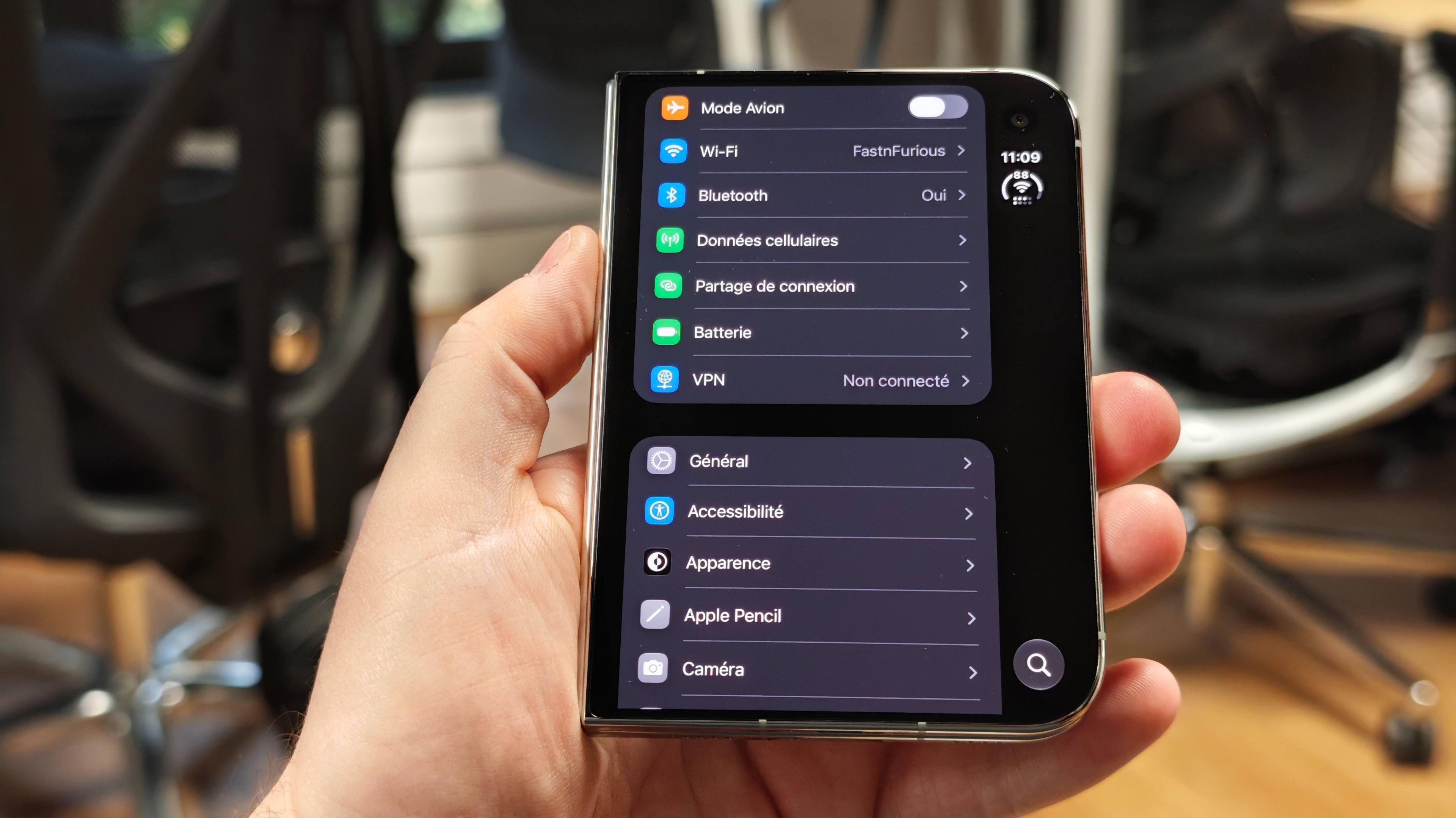
To be precise, the dock remains only on the home screen. In apps, the four shortcuts disappear and the bar only keeps the status area. For right-handed users like us, the controls stay reachable, but one wonders how left-handed users cope with this arrangement. Badly, apparently: no setting lets you invert it. Apple says it’s looking into the matter.
Apps: sometimes fantastic, sometimes frankly painful
That’s where the first version’s limits become most evident: some apps still run in compatibility mode, others resize but leave a black bar on the side, while the best-adapted apps finally utilize the entire available surface. Across apps, you don’t get a uniform experience.
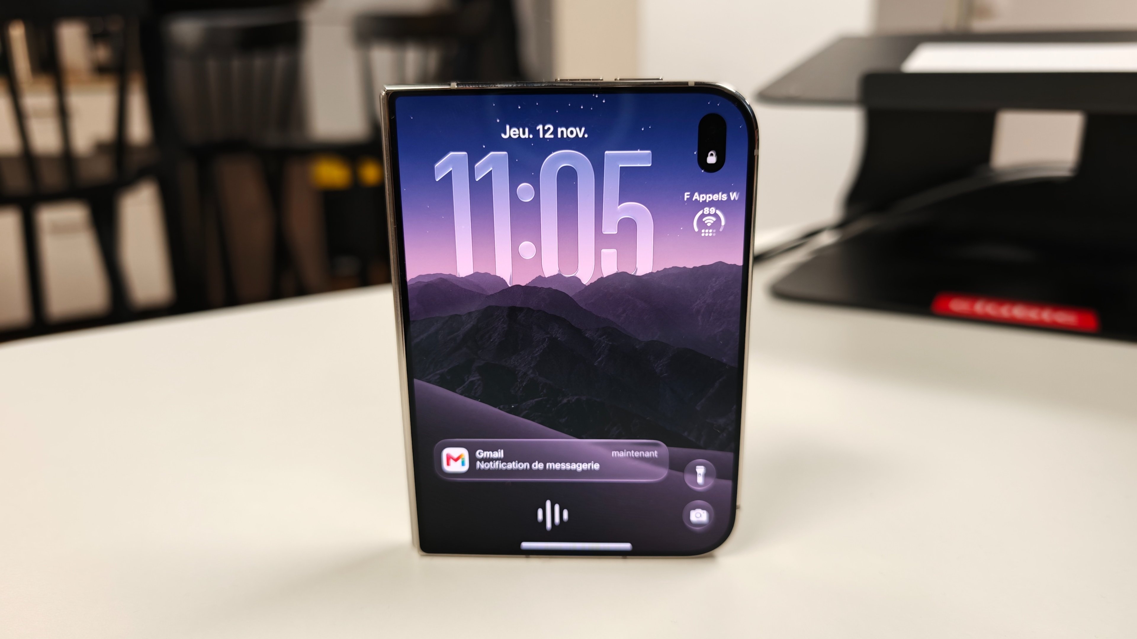
Discord is the most annoying example because we use it constantly—to chat with loved ones and to manage our AI assistant across channels. When closed, the phone shows that ugly black bar on the right. Open, it leaves a vertical app in the middle of a large, largely unused screen. And from reading reviews, we’re not the only ones to grumble.
We can press a button to enlarge the entire thing, but it’s still a zoom: the interface enlarges without showing any more information. On a device bought for a big screen experience, that’s a bit disappointing.
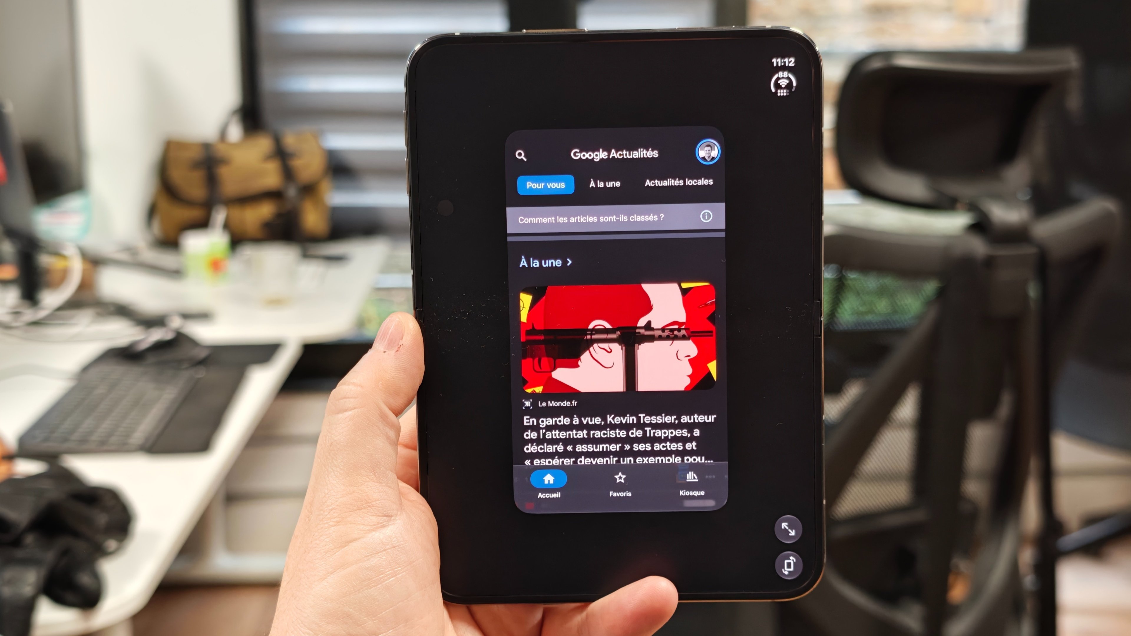
Chrome poses another daily problem. Updated for iOS 27 but not yet for the Duo, it keeps that black bar on the right, whereas Safari unfolds across the full width without question. Yet our bookmarks and browsing data are synced with Google. No desire to reorganize everything just to bypass a display fault — we’ll keep using Chrome while awaiting a fix.
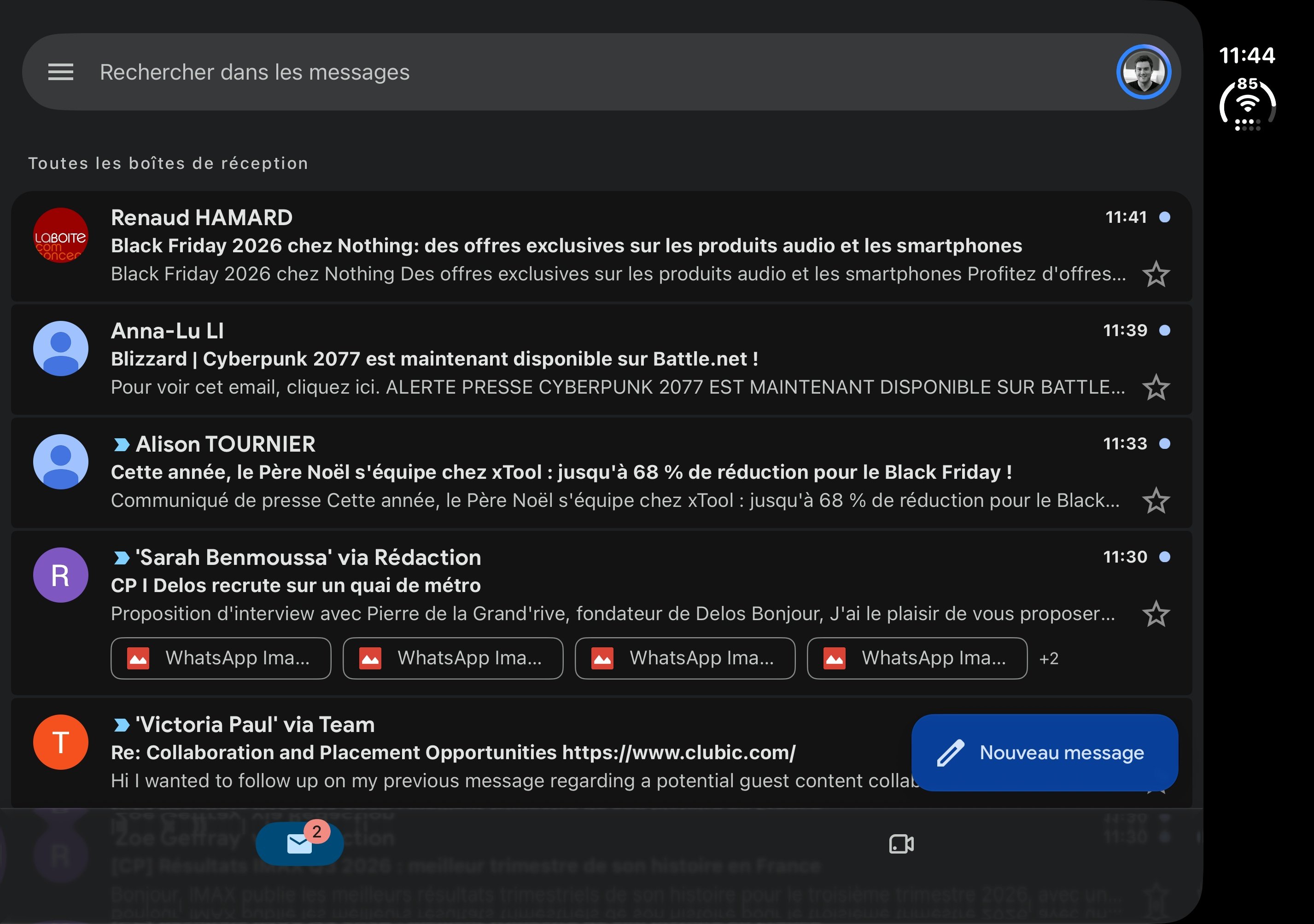
However, simply launching YouTube or WhatsApp in their adapted versions restores exactly the expected experience. The screen is effectively used, the workflow feels natural, and you stop thinking about compatibility issues.
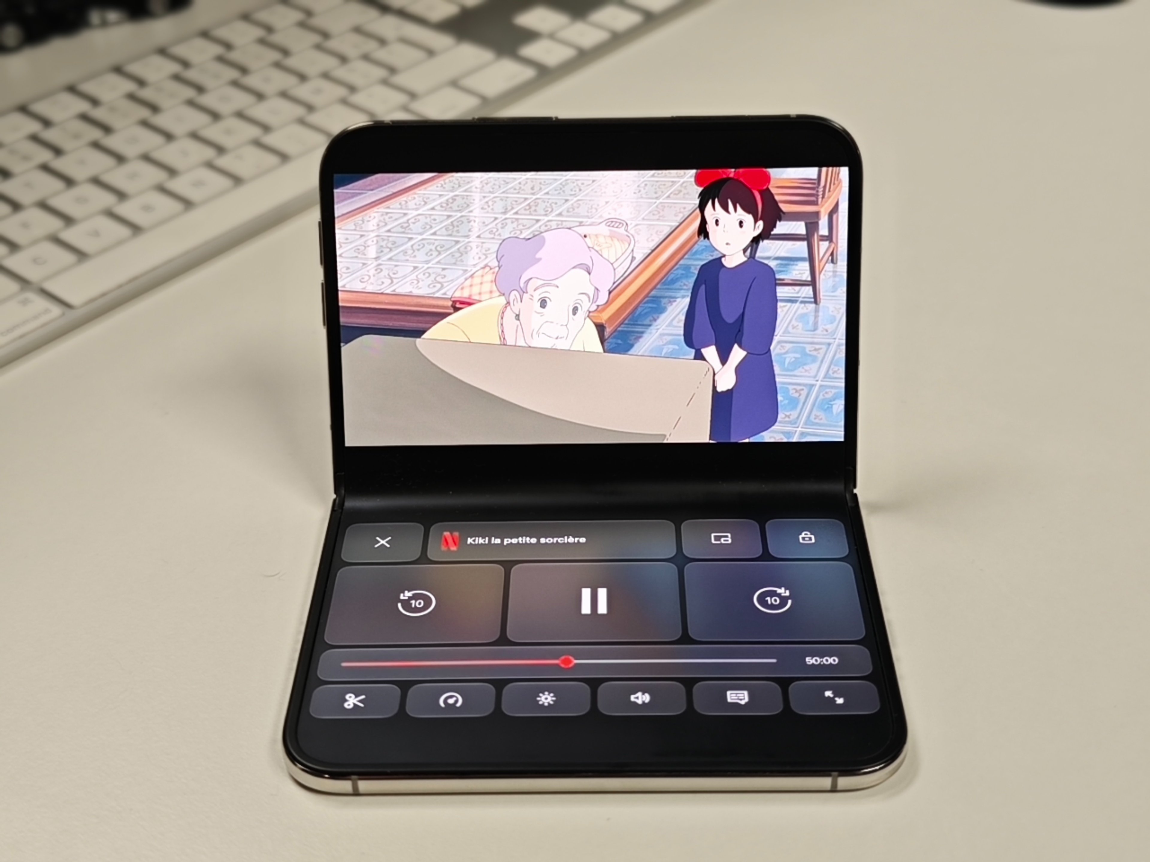
The transition between the two screens is a delight in itself. The image softens during the opening and becomes sharp again on the inner panel with a seamless continuity. It’s beautiful, precise, and, in our test, it runs without a hitch. This is the kind of detail we hoped Apple could deliver, and the result is up to the mark.
The burden of adaptation now largely rests on developers. Progress is ongoing day by day, and we’d like to believe in it, but the Vision Pro memory makes us cautious: a product can look impressive and still fail to convince if apps don’t follow suit. At this price, it’s worth watching how the apps you actually use perform, rather than relying on a demo with only Apple apps.
Split View works, but we hardly use it
For the test, we tried several combos: a browser on one side and Notes on the other for drafting an article, or Photos next to WhatsApp to drop images into a chat. It works and you can see the potential for heavy phone users.
Yet Split View remains stuck at two halves, with little flexibility to give more width to one app. A bit more leeway would have been welcome, though it doesn’t change much for us: once testing is over, Split View stays largely unused.
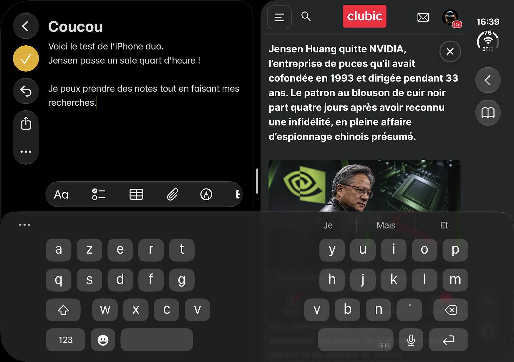
Better to be upfront: let’s avoid manufacturing a two-window productivity routine. Our initial goal was simply to view content on a large screen, and the Duo already handles that remarkably well.
Touch ID: we had grown fond of Face ID
Since the iPhone X, the gesture has been established: pick up the phone, let the screen wake, and swipe up. The unlock moment has become almost automatic, to the point that we keep repeating the motion on the Duo before remembering to place a finger on the side button.
Touch ID still recognizes the print quickly when the screen is already prompting for validation. If you start from a locked device, the delay becomes noticeable enough to be irritating. Apple deliberately inserts a brief pause on the lock screen to let you read notifications, just like on Macs and iPads. So you must keep your finger on the sensor to reach the home screen. The trick is to swipe the screen before touching the button, and unlock becomes instant. You just have to remember to do it dozens of times per day.
With an Apple Watch, it’s much simpler: the watch unlocks the phone without you touching the fingerprint. We adopted the feature without hesitation, but it’s far from the magic of Face ID. For payments or passwords, it’s back to Touch ID—the watch won’t approve anything.
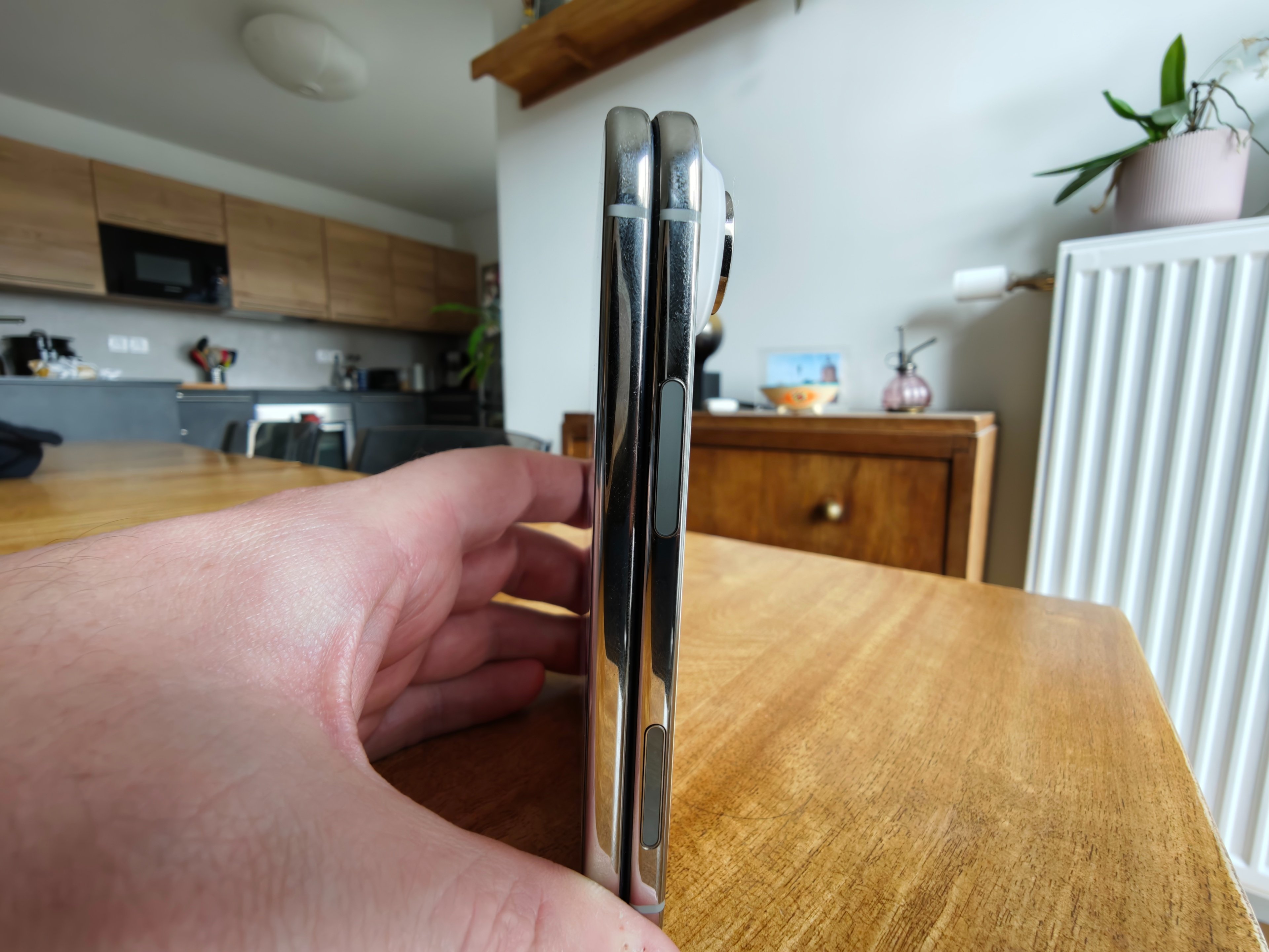
It also remains for purchases and confirmations that require a finger. Yes, it’s a habit to relearn, except we had actually grown used to living without it. On a device this premium, going back to Face ID would be hard to accept. We hope the next generation will bring it back.
Performance: power is never in question, but display can still trip you up
In terms of performance, there’s little to fault with the Duo. Everything feels fluid, apps launch quickly, and games run smoothly. In everyday use, you never feel the phone is holding you back.
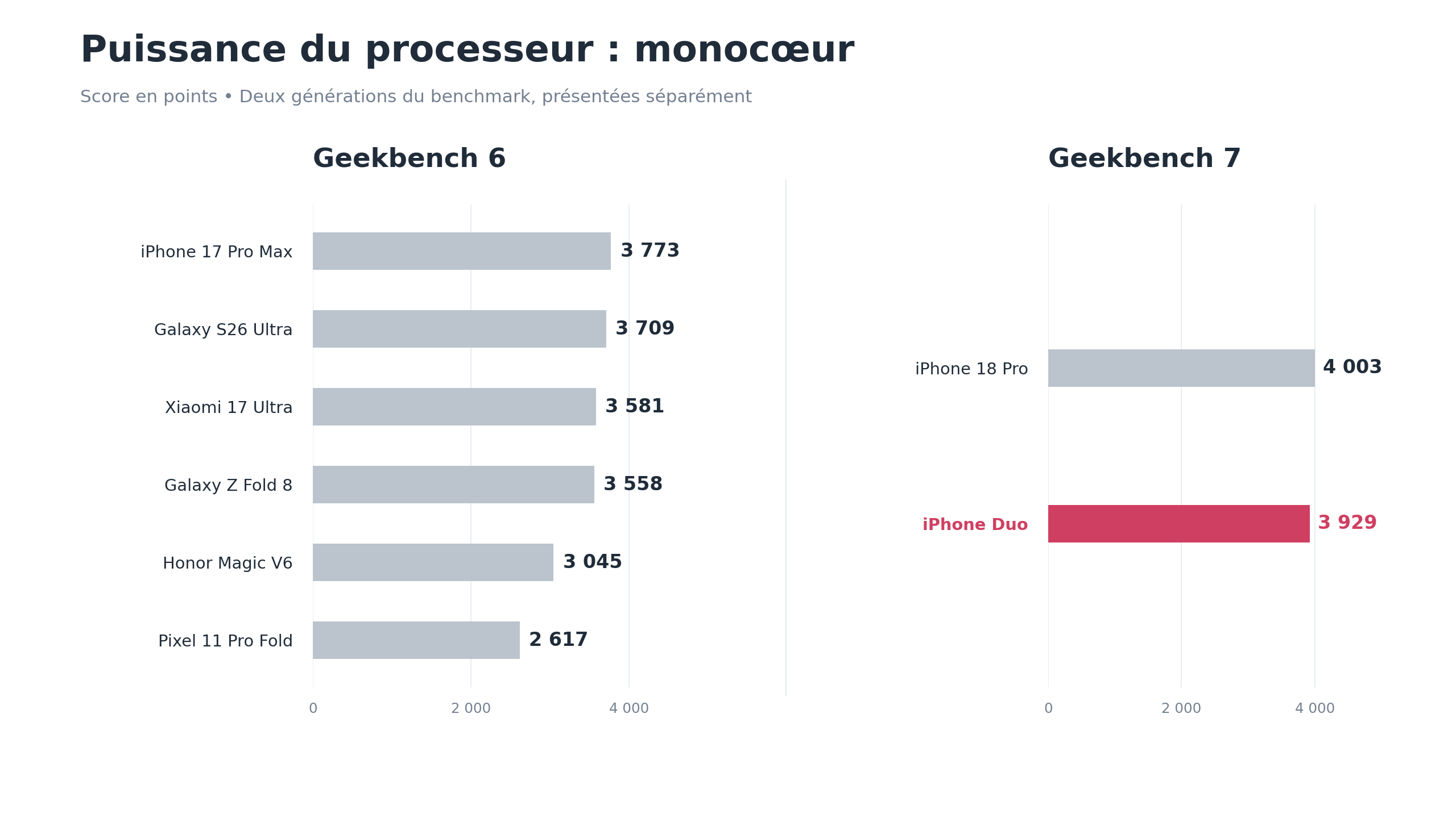
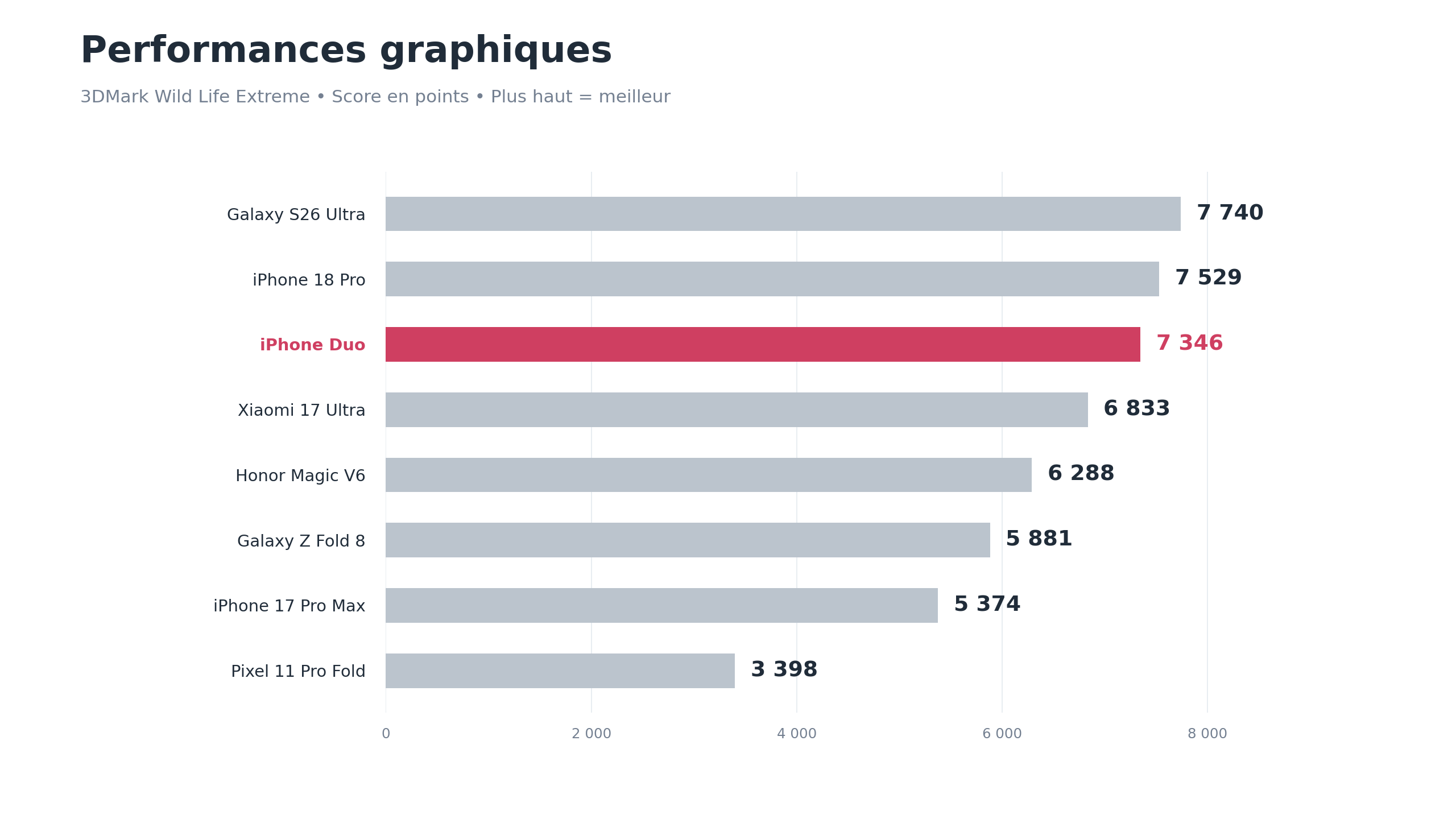
With less than 2% gap between the Duo and the iPhone 18 Pro, it’s hard to claim the foldable lacks punch. You indeed get the performance you’d expect from the A20 Pro, as demonstrated by daily use.
The Folio case helps a lot, though the €149 price tag reminds us that Apple also charges for the little pleasures that accompany its products.
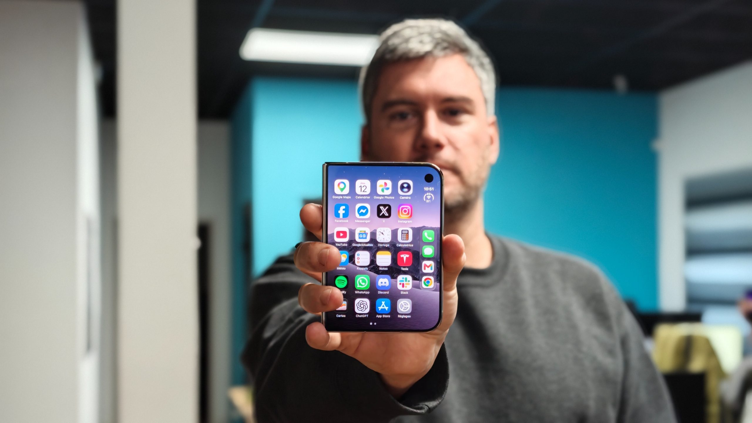
The external display is beautiful as well. Its colors, width, and proportions close to the main screen’s are appealing. It would be even better if apps let you take full advantage of it more often.
Interface: Apple tried to do things differently, and we’re still wondering why
Setup was performed with the device closed, restoring from backup, then we took time to inspect the home screen. And something felt off: everything seemed to lean to the left, while the dock and the status area sat on the right.
You might call us a bit pedantic about alignment, but this arrangement feels unbalanced. On the lock screen, the time, widgets, and notifications are offset; in some interfaces, a wide column is reserved for a few controls, leaving a lot of empty space around them. For Apple, known for meticulous software presentation, this choice is hard to understand.
The issue goes beyond aesthetics. In Settings, for example, content occupies a portion of the screen while a large dark band remains almost empty beside it. Yes, even Apple hasn’t finished its chores. We chose this phone for its width: losing part of it in this way is a real pity.
Note that the dock remains only on the home screen. In apps, the four shortcuts disappear and the bar only preserves the status area. For a right-handed person, the shortcuts remain accessible, but one wonders how left-handed users would experience this organization. Badly, from the looks of it: no setting allows inversion. Apple assures us they’re studying the issue.
Applications: sometimes stellar, sometimes really tedious
This is where the limits of the first version become concrete: some apps remain hidden behind compatibility modes, others resize but leave a black strip along the side, while the best-adapted ones finally utilize the entire screen. From one app to another, you don’t get the same device experience.
Discord remains the most vexing example because we use it constantly—to chat with family and to manage our AI across channels. When closed, the phone displays that ugly black bar on the right. Open, it leaves a vertical app in the middle of a large, largely unused screen. Reviews show we’re not alone in this griping.
You can press a button to zoom the whole thing, but that’s still a zoom: the interface enlarges without revealing more information. On a device bought for enjoying a big screen, that’s a bit disappointing.
Chrome pose un problème tout aussi courant. Mis à jour pour iOS 27 mais pas encore pour le Duo, il conserve cette bande noire à droite, alors que Safari s’étend sur toute la largeur sans se poser de questions. Or nos favoris et nos données de navigation sont synchronisés avec Google. Pas envie de tout réorganiser juste pour contourner un défaut d’affichage : on continue donc avec Chrome en attendant une meilleure version.
By contrast, launching YouTube or WhatsApp in their optimized formats brings back exactly the expected experience. The screen is used, the workflow feels natural, and you stop thinking about compatibility issues.
The transition between screens is a pleasure in itself. The image gradually blurs during the opening, then sharpens again on the interior panel with a clean continuity. It’s beautiful, precise, and works without a hitch in our test. This is the kind of detail we expected Apple to deliver, and the result is up to the mark.
The adaptation work now largely rests with developers. Progress is ongoing day by day, and we want to believe it, but the memory of Vision Pro invites caution: a product can be impressive and still fail to convince if apps don’t follow suit. At this price, better to watch how the apps you actually use behave than rely on a demo with only Apple’s apps.
Split View works, but we hardly use it
For the test, we tried several pairings: a browser on one side and Notes on the other to draft an article, or Photos next to WhatsApp to drop images into a chat. It works and you can see the potential for someone who spends a lot of time on their phone.
Yet the split remains fixed in two halves, with little option to give more width to one app. A bit more flexibility would have been welcome, even if it doesn’t drastically change things for us: after the tests, Split View mostly stayed on the sidelines.
Better to be frank: the aim isn’t to create a two-window productivity routine. The initial goal was simply to view content on a large canvas, and the Duo already handles this very well.
Photo: we can capture beautiful images, but we still miss our Pro Max
Price becomes the hardest concession. When you shell out €2,339 for a phone, you don’t want to choose between the form you like and the photographic capabilities you’ve grown used to.
In good light, the main module does excellent work. Photos are superb, including portraits, and the ultra-wide angle helps when you want to capture more of the scene. So don’t assume the Duo disappoints at every shot.
 Grand-angle. © Colin Golberg
Selfie with the rear module, or juggling with a €2,300 device
The outer camera yields good daylight results and remains decent most of the time, while the camera hidden under the inner screen is far less convincing. Its discreetness is nice for a movie, but Apple mainly reserves it for FaceTime, and that shows in both photos and video calls.



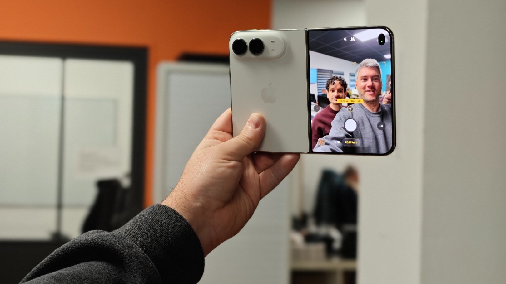
Fortunately, the Duo allows you to take a selfie with its rear module using the outer display to frame yourself. So you open the phone, enable feedback on the external screen, and extend your arm. Then you just frame everyone, trigger the shot, and try not to think about the possibility of this €2,339 smartphone slipping from your grip.
The photo was better, certainly, but we’ve known more relaxed selfies.