
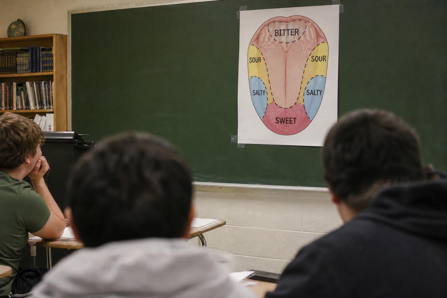
Every American classroom hung that pastel diagram of the tongue. Sweet at the tip, salty and sour along the sides, bitter parked firmly in the back. It felt neat, orderly, and true. And yet, scientists have spent years saying the picture comes from a misread, even a bad translation, of a 1901 paper. The map wasn’t science. It was a misunderstanding with a very long shadow.
How a neat diagram got canonized
In 1901, a German psychologist named D.P. Hänig tested taste thresholds across the tongue. He found small, subtle differences in sensitivity. Some regions were a hair more responsive to sweet or bitter, but nothing like strict zones. The tongue, he showed, is broadly capable of sensing all basic tastes.
Then came a translation and an oversimplification. Nuanced curves were turned into blocks. Relative differences became absolute claims. A later textbook graph smoothed the data into crisp regions, and the myth began to spread. Teachers loved its clarity. Students memorized its elegance. “It’s a perfect example of how a tidy picture can outrun evidence,” as one historian of science puts it.
What the evidence actually says
Modern physiology shows that taste receptors for sweet, sour, salty, bitter, and umami are distributed widely across the tongue, as well as on the soft palate and even down the throat. You can taste sweetness at the back, bitterness at the tip, sour and salty pretty much anywhere. You might notice slight differences in intensity, but there are no exclusive neighborhoods.
Researchers often call the famous graphic “a beautiful lie.” One sensory scientist told me, “The data never justified those boundaries.” The brain blends signals from many receptors, plus inputs from smell and the trigeminal system that senses heat, cool, and sting. Taste is a team sport.
Why the myth stuck around
The diagram was easy to teach. It fit on one slide, one page, one neat memory. In psychology and neuroscience, simple stories spread fast. Visuals imprint more strongly than caveats. Add the illusory truth effect—repetition breeds belief—and you get a durable fable.
Textbooks recycle what earlier textbooks printed. Editors hesitate to remove content readers already expect. And honestly, people like the idea that our bodies have tidy maps. It’s comforting to draw boundaries where nature draws gradients.
The modern taste picture, in brief
Today’s research highlights wide distribution and shared duties. Sweet receptors (T1R2/T1R3), bitter receptors (T2Rs), and others appear across many papillae. Sodium channels help mediate salt; umami receptors detect glutamate and related compounds. Sour is still partly mysterious, but it, too, isn’t fenced to one corner. The pattern is overlapping, redundant, and wonderfully messy.
As one researcher quips, “If your life depended on tasting poison, you wouldn’t want just one patch doing the job.”
What the 1901 paper really meant
Hänig reported tiny threshold differences—barely perceptible changes in how intense a taste felt at different tongue sites. The key word was “relative,” not exclusive. Somewhere between German prose and later English summaries, “slightly more sensitive” hardened into “only here.” A graph became a map. And a map became dogma.
“It’s the classic lost-in-translation moment,” says a science communication scholar. A few millimeters on a curve turned into borders teachers could draw with a marker.
A better way to teach taste
If you’re updating lessons, swap the myth for a model that’s still simple, but accurate:
- All basic tastes are sensed across most of the tongue, with small regional differences, and smell plus trigeminal sensations shape what we call flavor.
That’s one sentence students can remember without unlearning it later.
Try this at home
Grab a pinch of salt, a bit of sugar, a sip of coffee or tonic water. Touch each to the tip, the sides, and the back of your tongue. You will taste each one in every spot, though intensity may wobble by a notch. If you hold your nose, flavors flatten, showing how smell and taste are deeply entwined. Use clean tools, avoid allergens, and stop if anything feels irritating.
Why it matters beyond the classroom
The tongue map seems harmless, but it teaches the wrong habit: preferring crisp stories to messy truths. Biology is full of overlap, redundancy, and graceful fuzziness. When we demand borders where there are gradients, we miss how robust systems really work. “Science resists tidy myths,” a neuroscientist once told me. “But it rewards curiosity.”
So keep the charm of the old poster, if you must, as classroom art. Just pair it with the real lesson: your tongue is an all-terrain sensor, not a set of fiefdoms. The map was never the territory—and the territory tastes far more interesting.